THE DATA EQUITY FRAMEWORK
When it comes to equity in data science projects, trying to find all the ways that bias, assumptions, unfairness and prejudice can sneak in may feel overwhelming. Trying to look at a whole project and see all the equity weaknesses and issues is almost impossible. That’s why We All Count has developed: The Data Equity Framework.
Our decades of experience in data projects across sectors have shown us that they all have a similar life cycle (pipeline, model, roadmap, etc.). We All Count harnessed this universal data project structure and built a systematic and organized way of looking at each step of a data project for equity issues. This Data Equity Framework means that you don’t have to start from scratch. You don’t have to recreate the way your team already works with data. You simply need to learn how to apply the lens of the Data Equity Framework, follow simple steps and checklists and apply practical tools.
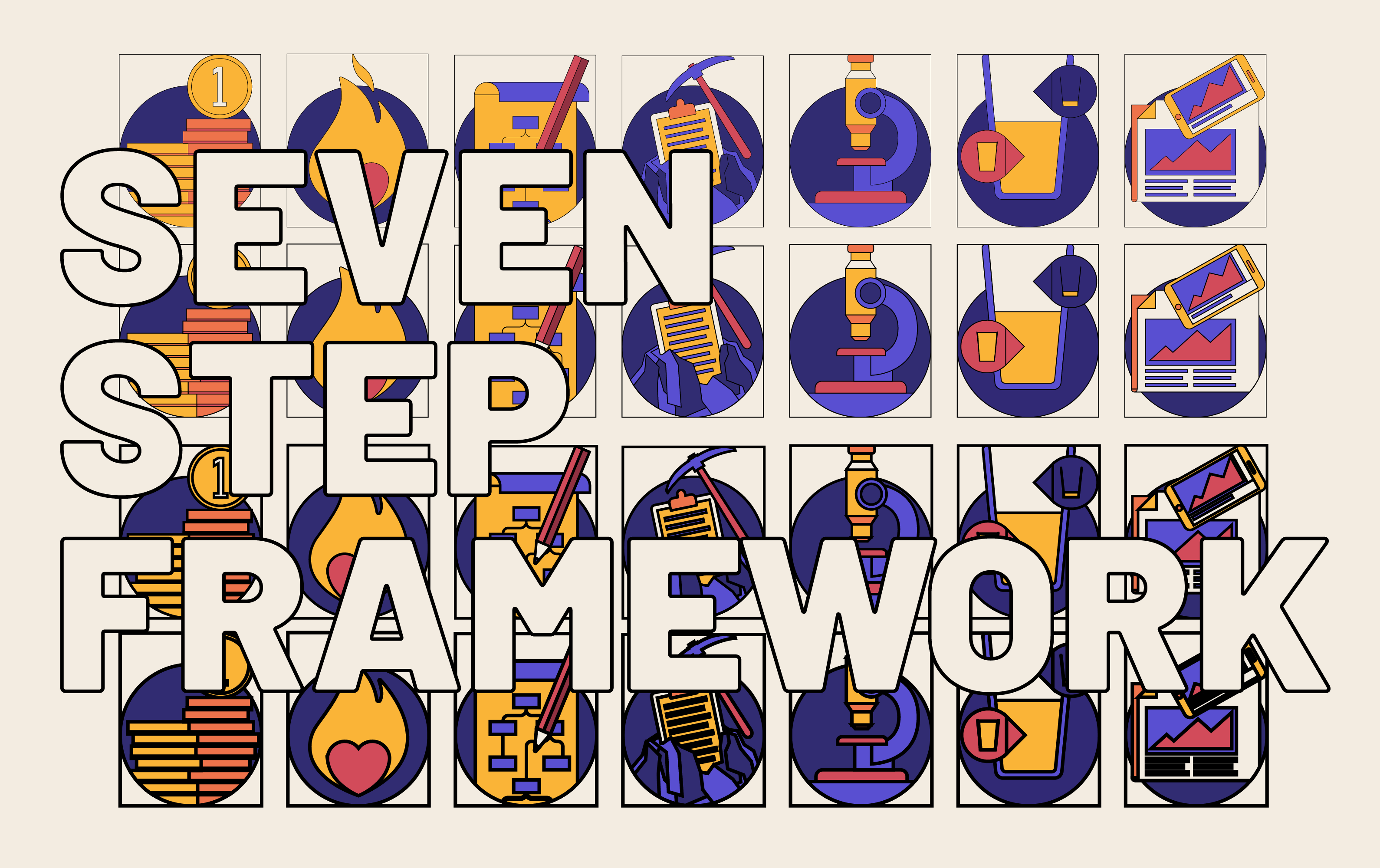
The Data Equity Framework is a systematic way of looking at data projects. It organizes every project into 7 stages:

FUNDING

ANALYSIS

MOTIVATION

INTERPRETATION

PROJECT DESIGN

COMMUNICATION & DISTRIBUTION

DATA COLLECTION & SOURCING
Though the stages may have different names in your industry/project type, they are applicable across all sectors and projects we’ve ever encountered including corporate, NGO, government, and public/private projects.
At each stage, there are unique challenges and opportunities to improve the equity in your project. Our work shows that learning and applying this Framework to your projects leads to immediate and sustainable improvements in equity. The typical interaction with the framework goes like this:
1. Discovering
You/your project team/your organization become aware of these stages in a data project and start thinking about projects in these terms.
2. Exploring
You/your project team/your organization begin to look closely at each stage of your project for potential equity issues. You learn about what the issues are, why they are issues, and what can be done about them.
3. Implementing
You/your project team/your organization learn to use tools, systems, and processes that embed equity, detect equity issues, and lead to measurable improvements in the overall fairness of your project at each stage.
4. Sustaining
The Data Equity Framework is second nature to you/your project team/your organization. You have moved beyond approaching individual stages with a collection of tools towards a comprehensive system of data equity best practices that efficiently and robustly increase the equity of your projects and data products.
Your transparency and ability to demonstrate the use of the Framework increase trust with stakeholders, project team members, and the general public.
Wherever you are in the process of implementing the Data Equity Framework, We All Count can help you get to the next step.
Other than increasing equity, the Data Equity Framework leads to all kinds of benefits:

Funding
Where are the resources for the project coming from? How a project is paid for can have equity impacts beyond the obvious dangers of intended bias (e.g. “welcome to our pharmaceutical company, I think you’ll find your results very supportive of our products”). Even with the purest of intentions, funding scope,
Not only is funding worth examining on an individual project level, but the larger picture is also worth a look too. Who isn’t getting any money? Maybe a different organization, company, or government branch has a different perspective on the same issue, but the capital is too concentrated in a few existing data projects. On the other hand, maybe the funding is affecting data equity by being too diffuse. Do we need 137 studies in the same area, none with enough money to do the scope of impact reporting needed to answer their questions?
Money makes the world go round but so does data. Where and how we allocate resources as a society, and within our organizations can affect the fundamental understanding of our world, and sometimes cause us to get the picture flat wrong. Anybody with any kind of mandate to not only be right but also fair in their analysis needs to consider the impact of the foundation of their projects; the funding.

Motivation
What is the goal you hope that data science can help you achieve? Why we do a project has a huge impact on all the following steps in a process. Are you asking an open-ended question? Trying to find support for an existing policy? Trying to evaluate the impact of something? Trying to explain why something is happening? Trying to communicate a story using the underlying data? Each of these questions will require a wildly different project design, scope, methodology, etc. With data equity in mind, the ‘why’ can inform the ‘how’ and make huge improvements in data science projects.
Hidden or secondary agendas are common. Stated motivation like ‘evaluate the impact of our project’ need to be considered as much as hidden motivation ‘need to show awesome impact for next board meeting’. At We All Count we believe that you cannot separate data science from the humans who are doing it. Embracing the reality of hidden agendas will help everyone do better data science and get the information they actually need.
The goals of your project need to be understood holistically rather than separately in order to get better, more equitable results. There’s a big difference between ‘we need to answer this question’ and ‘we need to answer this question, in time for the report deadline in two months, without going over budget, while showing off the data methodology we’re famous for, with results dramatic enough to get media coverage’.
It’s not about pretending that all motivations are noble, scientific, and objective. It’s about accounting for these goals and how they impact every piece of data science, making this process more open and more effective for everyone.

Project Design
How is your data project going to achieve your goals? Constructing the methodology of any data project has many potential equity pitfalls. Probably the most prevalent bias here is towards comfort. What do the people involved know how to do? The amount of inappropriate method choice is staggering, and often just due to limits of understanding, training, and level of comfort. You can almost forgive someone who always runs Randomized Control Trials to try to answer all questions with an RCT, but you simply can’t.
The design of a data project is inherently subjective because it runs up against the limits of what the people running it think to measure. Often, ‘rigorous academic studies’ are based on the traditions of a monolithic academic perspective that dictates what factors are relevant, what populations are relevant, and what methods are relevant. At We All Count, we contend that there is no objective project design, especially when measuring anything to do with people.
We’re excited as the world becomes more and more data-literate to see project design methods that reject the assumptions of a limited traditional perspective. The new breed of data project designer is more international, more diverse, and more sensitive to the perils of unexamined project architecture. The even better news is that no matter who you are, by using more scientific methods to frame your project, by picking more appropriate methodology, and by collaborating beyond your comfort zone, everyone can design projects that aren’t shackled by the limited individual perspectives plaguing ‘objective’ data science.

Data Collection & Sourcing
Where are you getting your data from? Whether you are plunking a quick
When collecting information first hand, you have an incredible opportunity to control the quality of the data for later analysis. At We All Count, we think about data collection like a sacred duty; every time you collect data you add to humanity’s collective knowledge about itself.
The requirements for equitable data collection are complex. It’s not as simple as trying to ask everyone and not leave people out. Sample selection is important of course, but so is survey design, collector behaviour, scope and scale, cultural translation, collection mediums, data corruption, compatibility and fidelity and much more. It’s super worth doing, if for no other reason than your data will be more useful.
No matter what scope of collection you’re talking about, no matter anecdotal, self-reported, or some automated digital count, if you approach the collection with equity and unbiased representation as a goal, you will add a jewel to the pile of human understanding.
Now, if you’re sourcing data, rather than collecting it first hand, instead of a jewel, you’re probably better off considering the data a steaming pile of garbage. At least until you know it’s not. A comprehensive data biography – the where, why and how of any dataset – is absolutely crucial to equitable analysis. Get to know your data on the nitty-gritty, how-did-they-get-this, look-at-the-original-survey-wording, who-did-they-miss, level. When you really know your data and run it through the filter for potential bias and equity issues, you can begin to use facts and figures with confidence. You can maintain a buck-stops-here attitude towards ensuring inclusive, non-garbage, truthful data science.

Analysis
How will you process the data once you have it? Statistical analysis is often seen as objective and free from bias
Highly trained reputable analysts can be given the exact same dataset and come up with multiple results. And the majority of these different results are correct – just different. How? Why? Because the statistical methodology that you use, the variables that you choose to include or exclude from the models, the way you choose to classify each data point, etc – all change the results. This doesn’t make it incorrect, it just makes it embedded with your worldview.
Every day the experts in the data science world expand their horizons, learn new methodologies and examine familiar methodologies with a critical eye. The real key for sustainable change in data analysis lies in the general public’s awareness of the inherently subjective nature of analysis and how these tools can be used in a more transparent and inclusive way.

Interpretation
How will you understand your results after analysis? The common mistake can be to skip this step entirely. Too often the ‘results’ of an analysis are thought of as a static two-dimensional object, they are what they are. In reality, all data results are meaningless before an interpretation is applied to them. The output of any statistical model – no matter how simple – is a complex 3D object that looks different from different perspectives.
How we interpret the results of data analysis is related to our worldview, our experiences, our opinions, and our biases. A result that shows a trend of an indicator increasing – whether you think this should be interpreted as a good thing or a bad thing is subjective. Data results don’t carry any intrinsic meaning. Assumptions about causality, correlation, expectations, and relevant factors often lead to flawed conclusions or biased ‘facts’.
By considering data results from a variety of perspectives – social, cultural, mathematical, historical, etc – we can reduce the potential inequity of a one-sided interpretation. More importantly, just stopping to acknowledge that ‘interpretation’ is a real step in this process, that so-called ‘results’ or ‘findings’ don’t speak for themselves, will put your best foot forward into a world where data decisions come from a place of understanding and not one of unintentional ignorance or outright pretending. Next time you find your self-thinking ‘the results say…”, stop and shift your paradigm to: “I see this in the results…”.

Communication & Distribution
How are you going to tell people about your information? Your strategies for communicating, persuading, and explaining your data can be heavily lopsided. At the very core is the narrative frame which you’ll use to contextualize your information. Even once you’ve settled on an interpretation of your results, you still need to decide on where they fit into the larger picture, and how they should be received. An encouraging underdog story can be a threatening tale of insurgency and chaos from a different perspective. A tone of shock could be swapped for one of discovery. The same result can be
Next, we need to be aware of language and presentation. How are we persuading the audience? At We All Count, we believe that even the most ‘objective’ or ‘academic’ assertions are inherently persuasive and that those who pretend not to be are the most dangerous. Are we using absolute or relative terms? The balance of assertiveness and transparent uncertainty is key to equitable but effective data communication.
What are our assumptions of our intended readers? All too often cultural assumptions in description and explanation of data science limit the information to the milieu of the producer. Assumed vocabulary, concept awareness, and spoken language all greatly restrict access to data science publications, often most severely affecting the very stakeholders who are the sources of the data. When you don’t assume that your audience
The science and art of data visualization is exploding as new technologies and more effective aesthetics are developed. However, the weight of traditions and assumptions in data viz can be hard to escape. A line chart is not a universal symbol, easily understood by anyone and without matching data literacy, vocabulary, imagery, and language. Even when studies are conducted about how to improve data viz comprehension, the results reflect the American college-educated students they are performed on! Data viz interpretation is a type of literacy. We can move past the mistake of expecting everyone to be trained in the same style or simply adhering to the limited advice of ‘experts’ in the field. When we approach the problem of wrapping the human brain around numbers with renewed creativity and truly innovative technology we turn charts into art.
Lastly, consider the mediums used to distribute information. An interactive, intuitive web animation might be highly effective for communicating to people with low literacy but completely cuts out those without an internet connection. An academic journal offers gravitas and institutional backing to underscore your point but significantly restricts your potential audience. A newspaper represents a huge potential readership but locks your data behind a paywall. All distribution systems come with compromises. With equity as a consideration, we can make choices that break down barriers.
