The way that data is communicated is inextricable from data itself. We should pay attention to how we symbolize, contextualize, and convey our data. Right now, data visualization is a hot topic, with new research and understandings coming out all the time. New mediums like interactive and dynamic graphics, easy to create videos, and live, up to the minute dashboards offer all kinds of exciting ways for us to get information to our audiences. In all the fascination with new forms, it can be easy to miss foundational equity problems in data communication.
At We All Count, we work on the cutting edge of data viz design and we have a lot to say about the equity ramifications of various styles, mediums, and methods of distribution. Today though, we want to start our conversation about communicating data at a simpler level: symbols.
All data communication is narrative. Even the most ‘objective’ or ‘academic’ chart has placed an interpretation of results into a very human framework in order to communicate it. That’s how it should be, humans tend to understand everything as a story. One of the most important parts of telling data stories are symbols. Applying meaning to shapes, colours, icons, scales, direction and motion allows us to get a ton of complex information through to the human brain. Of course, symbols aren’t universal and have to be understood by the audience – an often-overlooked area of equity issues for another article.
What’s in a Symbol?
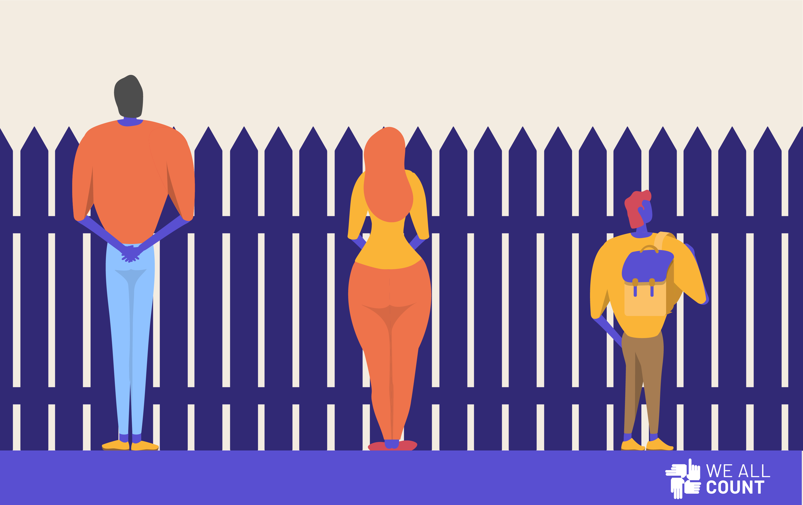
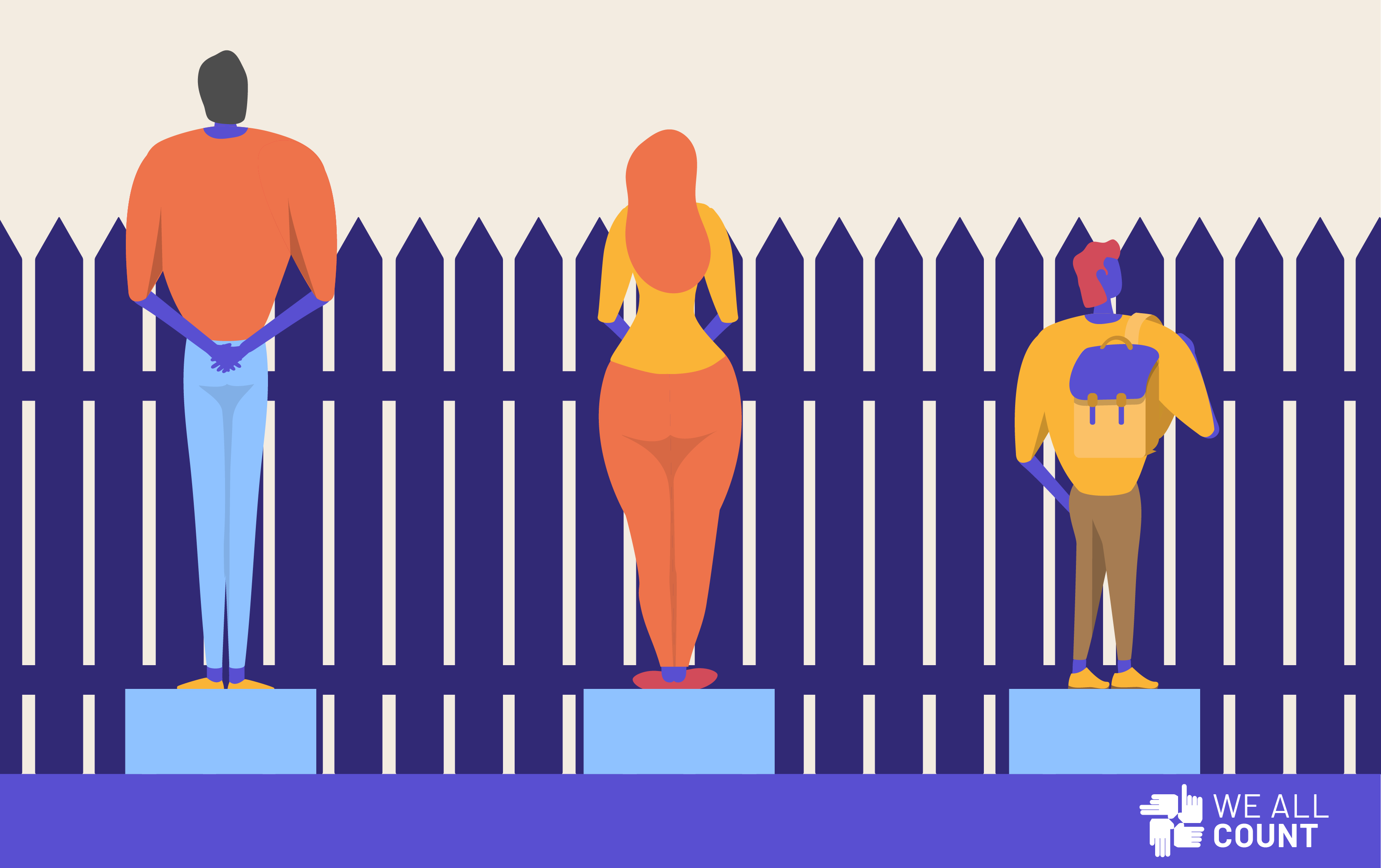
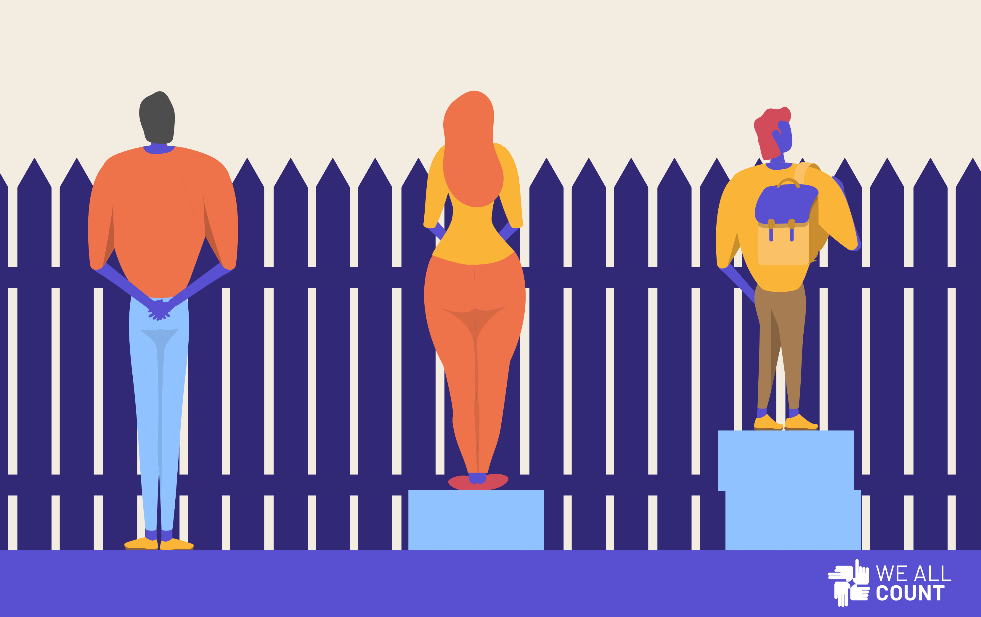
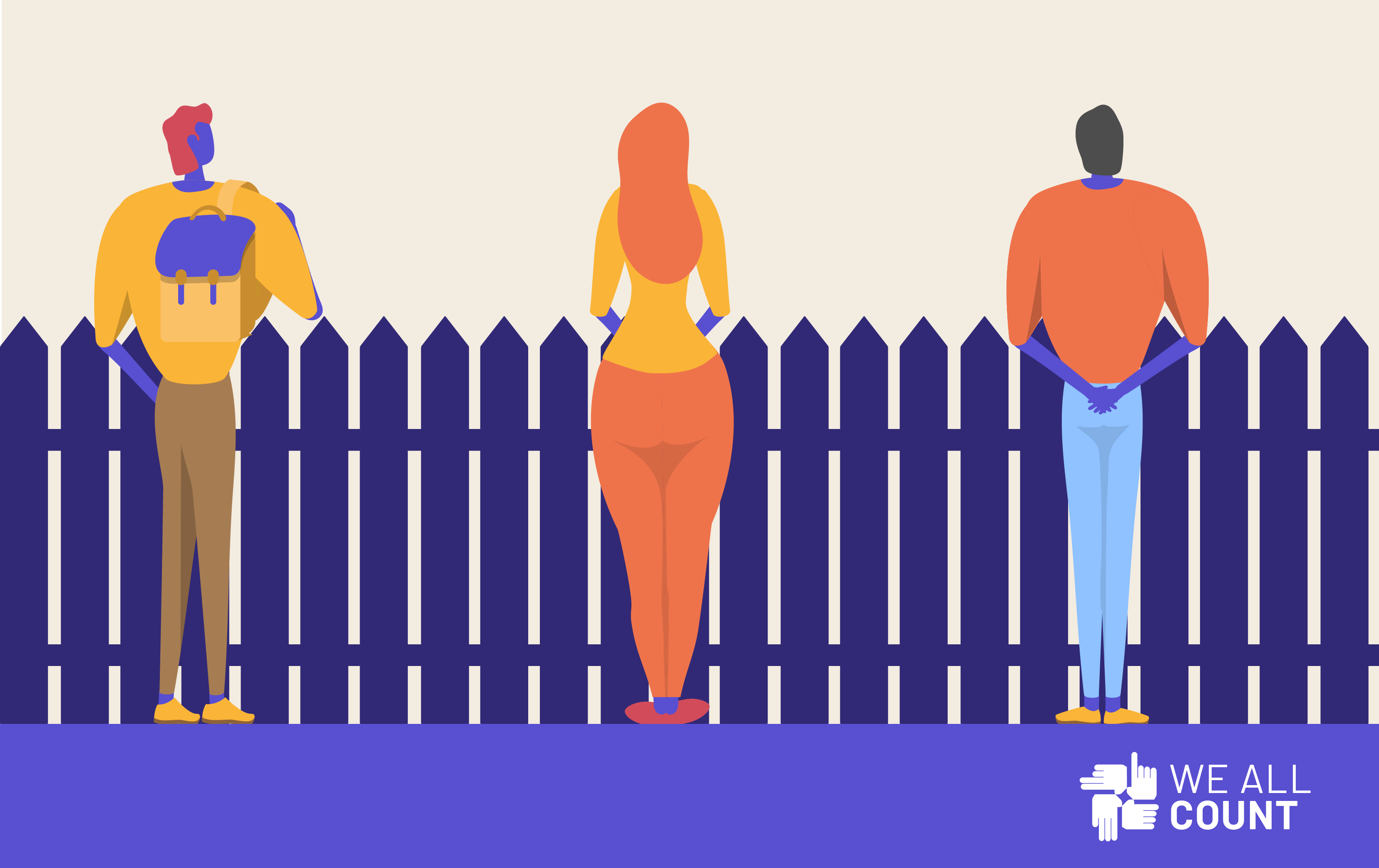
The following series of images is a widespread visual metaphor about equity and equality. In the first image, the problem is represented: some people can’t see over the fence. In the second image an ‘equality’ based solution is proposed: a box for everyone. However, this doesn’t solve everyone’s problems and gives a boost to people who didn’t need it in the first place. In the third image people are given boxes according to their needs and a ‘equity’ solution is created where everyone can see over the fence.
INEQUALITY
EQUALITY
EQUITY
It’s a clear, resonant way to communicate an idea in pictures. We can see why it is so often reproduced. However, we’d like to use it as an example of the equity dangers of not examining your symbols deeply enough.
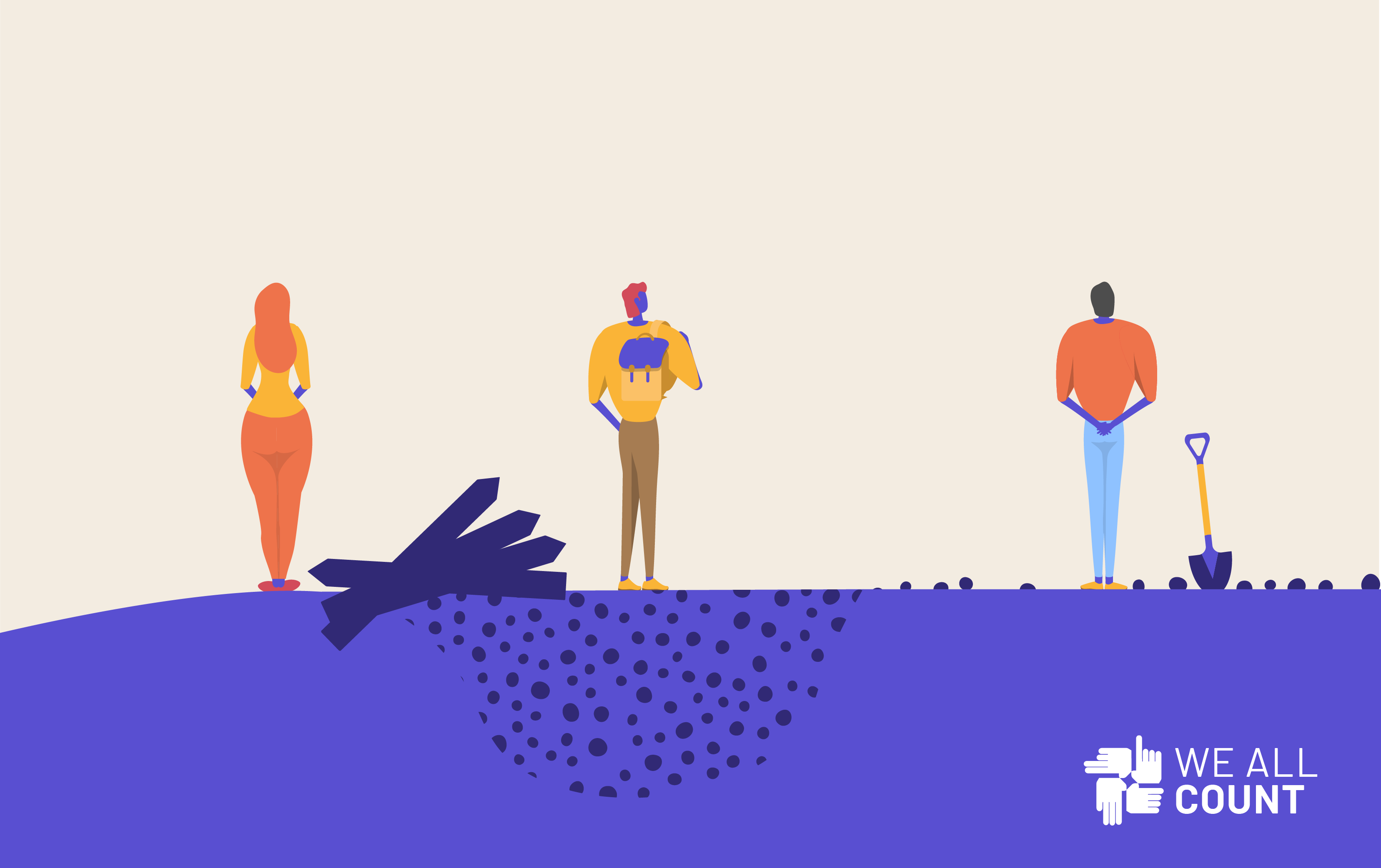
There’s something off about the images that doesn’t seem to reflect the way we perceive the issues addressed in the metaphor. This is a good example of how even a very simple series of images is a specific story that, intentionally or not, indicates a specific world view. Like an x or y axis, the elements of these images are representative. The barrier to what the people want is represented by the height of the fence and the advantages that the people have in getting what they want are represented by how tall they are. Simple enough.
However, there’s an equity problem with this choice of symbols. When you use human height as an indicator of ‘advantage’ you are suggesting that some people are inherently disadvantaged in the way that some people are inherently taller or shorter. It suggests that different types of people need different types of help. This choice of symbol enforces a worldview that A) people are different and some are inherently disadvantaged and that B) people are the cause of their own experienced inequality.
If we reject that people are inherently disadvantaged, let’s not use the people’s heights to represent that and make them all the same height:
Sure, it feels more equitable, but it doesn’t really communicate anything useful. There’s a second issue with this visual metaphor. This time it’s not with symbol choice, but with symbol use. Having one shared fence suggests that everyone is facing the same barriers. If you believe that people are generally the same and that their barriers (institutional, cultural, legal, economic, historical, prejudicial, etc.) are different, then let’s show that with different fences. Oh wait, but we also lost our way to represent advantage once we made everyone the same height! Let’s show advantage with different ‘ground level’ starting points:
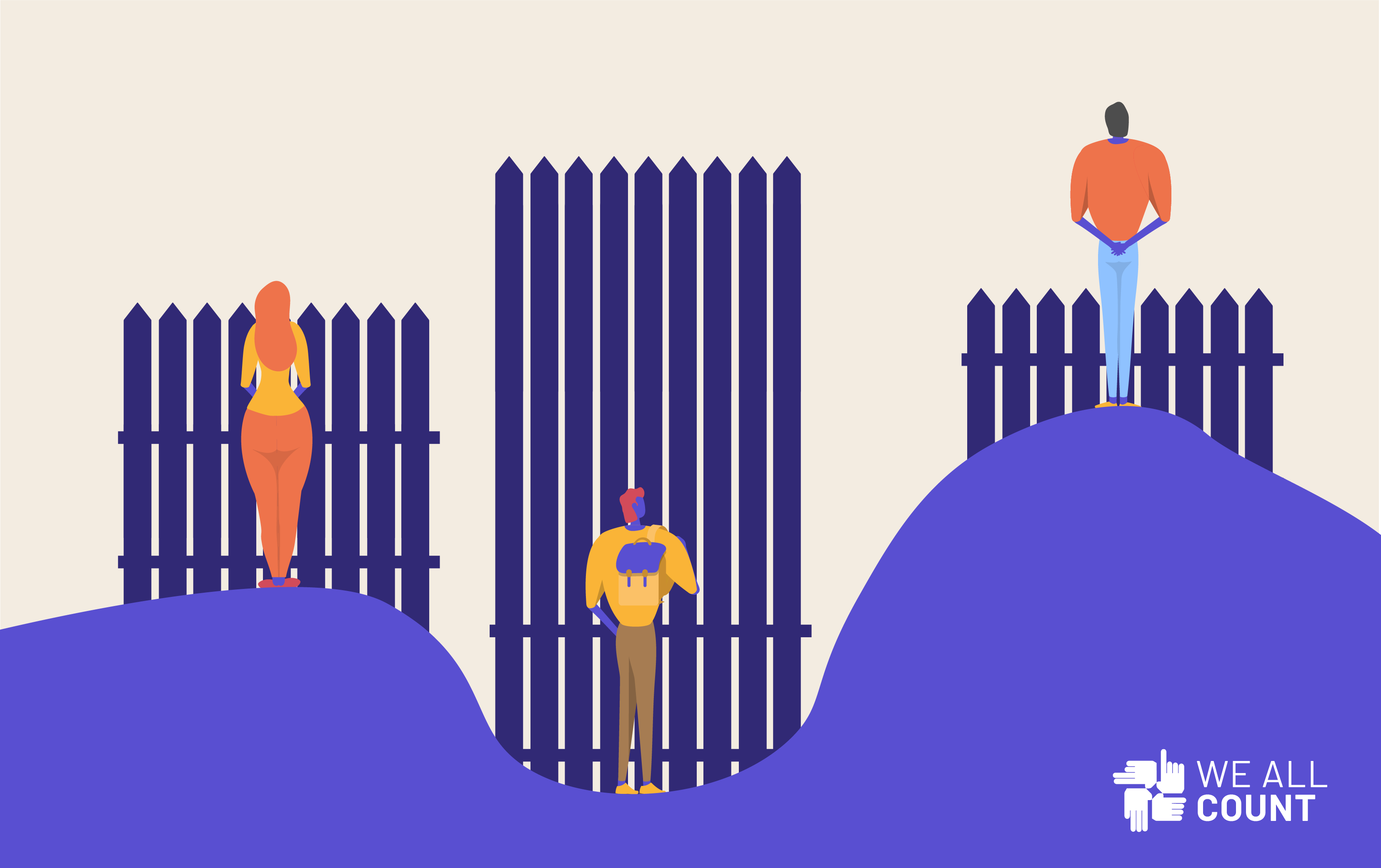
Now by changing what symbolizes what, we have an image that can be used to communicate the same, important idea but better reflecting our world view: that people are the same, but their barriers and starting points vary. When we want to see the differences that equality or equity-based solutions can have, we can visualize them. We have visually put the problems onto the barriers and uneven ground, rather than putting the onus on the people to figure out how to get taller. This isn’t a more ‘right’ or ‘correct’ way to visualize this it just better represents our world view and what we are trying to communicate.
That’s what we want you to keep in mind at the outset of our exploration of step 7 of the Data Life Cycle: Data Communication and Distribution. All communication is storytelling that couches your data in a specific world view and that even at the least complex, least technical mediums have equity pitfalls that need attention. We’re in the midst of a revolution in how we communicate and use data and we’re excited to discover the best ways to keep the world of data science equitable, fair and free.